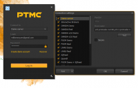
Start trading with PTMC
ello PTMC traders!
In this topic we’ll tell you how you can start trading with PTMC, having just few simple steps.
Already tired of reading? Here is the same instruction in video format for you
STEP 1. REGISTER IN COMMUNITY
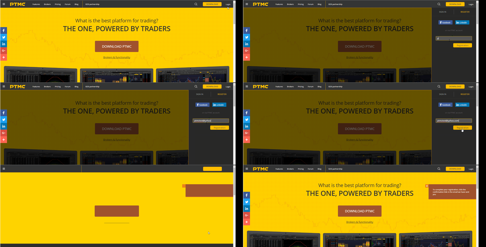
The first and basic element of the platform's functionality is the PTMC account. You can register an account by clicking LOGIN on the main page.
Then, click "Register" and enter your email. As well you may register via you social profiles - Facebook or Linkedin.
Check your email and follow the link we've sent you.
Now you're successfully registered and logged in! You can find your credentials in the second email we've sent you. You can change username, password, email, name etc in the "My Profile" section. For that, follow the tabs "My Profile", then "Profile" and click "Edit".
Don't forget to save changes when you're done.
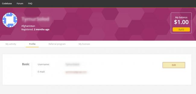
STEP 2. GET THE LICENSE
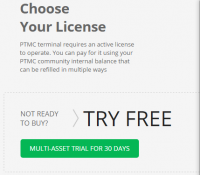
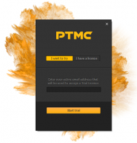
If you want to use PTMC - you need to have a license. If you are a newbie in our community - you have 30 days free Trial license. To activate it, just press "Multi-Asset Trial for 30 days" button on the Pricing page.
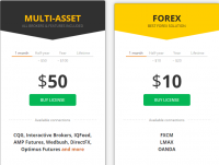
After your Trial license will expire date, you can buy Multi-Asset or Forex license. Just click "Buy license".
STEP 3. PTMC TERMINAL INSTALLATION
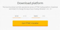
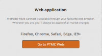
Now it's time for you to get acquainted with the PTMC platform itself! We offer a Desktop application for using it on your PC and Web Application for any web browsers. The desktop app is divided into two types - Beta (it includes the latest features that in test mode) and Stable.
After downloading, please install the PTMC platform.
Before you install PTMC make sure that your computer meets our minimum system requirements:
- Windows: 7/8.1/10
- 2 GHz processor
- 2 GB dedicated RAM
- 140 MB available disk space
STEP 4. LOGIN WITH YOUR BROKER ACCOUNT
Create a Demo or Live account of one of supported brokers or data feed and enter the platform with the credentials from our broker. For the following brokers you need to use CQG connection with their credentials (don't forget to check connection type - demo or real - in the connection settings):
- Direct FX
You can do it in two ways:
- directly through Login screen (Select the broker you want to connect to and click Create demo account)
- via our website on the Brokers page
- directly the broker’s website
After receiving the login and password, enter the data into the corresponding fields.
STEP 5. THE LICENSE ACTIVATION
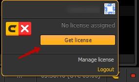
After launching the platform, press the "C" sign in the lower bottom corner of the screen.
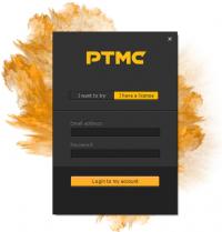
Then enter your PTMC website credentials.
If you have activated the license before, you will see the Active status of your license and the amount of time left until the expiration. If you have not activated the license before, you can do it here by pressing "Get license" button.
That's all!
Now you are ready to trade on PTMC platform! If you still have any questions - feel free to ask on our forum or via Live Chat.
Er, still would like to know about the price and availability of PTMC please, as I am looking for something that I can buy as opposed to renting or whatever, can you clarify this point please?
The FXCM website makes no mention of PTMC so am still confused about this point.
Also non standard time frames are taking a few minutes to load up on a chart while standard time frames load instantly, is there a reason for this?
regards
Robert
Robert, at the moment you can use PTMC for free. If we'll change our price policy we'll notify it beforehand.
Regarding timeframes: non standard time frames are generated on minute data. The creation of non standard time frames depends on the speed of receiving data from FXCM.
kaspo999
Er, still would like to know about the price and availability of PTMC please, as I am looking for something that I can buy as opposed to renting or whatever, can you clarify this point please?
The FXCM website makes no mention of PTMC so am still confused about this point.
Also non standard time frames are taking a few minutes to load up on a chart while standard time frames load instantly, is there a reason for this?
regards
Robert
Hello Robert. We have some idea how to improve performance of creating non standard time frames, but result will depend on time frame. For example for 4min bars we sure need load 1 min bars, but for 10min we can use 5 min, instead of 1min. Going to try to implement this next week.
1. "Indicator and colored tag" - Ok. Will add ability to hide this tags for each line of indicator.
2. "cci requires a facility for inputting levels at zero, 100, -100, 150 and -150 but it is nowhere to be seen" - Ok. Will add this line
3. "change or customise open position and stop loss lines etc" - Chart - > Context menu -> Visual trading Here you can hide or customize style of visual trading lines
4. "pip value calculator the way FXCM do it" I almost sure we will be able to show this info.
Thank you for your feedback. Really appreciate it.
"maybe a customisation for the tabs" I think it is a good idea. We have made some research and now we know that average trader usually has only one monitor and middle screen resolution, so we start working on our user interface to make it more compact but still convenient and functional.
According to the tab charts, we can, for example, add option for charts panel name:
- Full (Panel name+Symbol+Time frame) "Chart EUR/USD 1m"
- Symbol+Time Frame "EUR/USD 1m"
- TimeFrame only "1m"
"I am not sure you want all this dialogue on the forum"
I think forum is the best place. Because we are discussing changes in platform and maybe somebody can propose or add something. And also if another traders will agry with your suggestions and write us about that - we will respond quickly and with high priority.
"in the first tab I would say remove the word 'Chart' as we all know it is a chart."
Not sure. We can dock together any type of panels in any place, not only charts. So you would not be able to differ panels.
I undestand your proposal about customizable quick access toolbar. Will discuss it with our team this week.
I have read all your posts and can tell you it match with our current direction in interface development. We try to make it more compact, that allows traders to use
platform even on small monitors. But it will take some time because it need work not only developers but designers and analytics. By the way our designer already works on removing Workspace toolbar because usually trader have only one or few workspaces. We decide combine it with status bar to save 20-25 pixels of vertical space. So I think we will make all this changes step by step and will inform you about that.
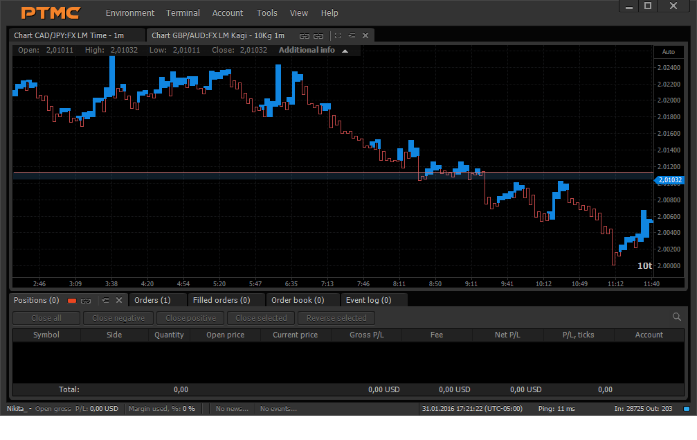
Yes - very long chart tab names. Need to do somehing with that. Yes - there is unused space on the right side of main menubar. We can use it for something usefull.
Hello kaspo999! We have made an update this weekend which includes some of your proposals: color settings for visual trading, ability to hide indicator's tags, additional lines for CCI indicator. Also now you can place toolbar on the top panel to save vertical space. For current moment it can be customized only with panels button, but we will add chart and trading functions in the nearest time. Waiting for your feedback!
BTW: where is all your posts?
Hello Bogdan
Hi, I have removed my posts as most show FXCM Marketscope platform which are slightly modded so just being careful.
Plus some pix of your PTMC have my mods on them.
Even now I have done so again, just cannot resist you see.
Dont want to fall foul of my broker-your people etc.
I have sent an e-mail to you about where I want to go with my platform, so hopefully you have received this.
Also this explains the different colors I have created on PTMC, so hope you get that mail and hope you can excuse any liberties I may have taken.
As for the changes you have made, yep, certainly splendid.
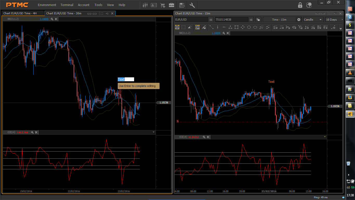
Really like the toolbar location now, and speaking for myself there is easily enough space left to accomodate all my favourite icons.
As for the cci and bb's, yes much better, and certainly easier on the eye with tags removed, and if anyone really wants them they are still a click away.
However, the trading lines could do with a letter S for short or L for long instead of the icon you currently have, oops, like I have done above, and maybe show the current profit-loss as number of pips as +10 for 10 pips in profit or -5 for 5 pips in negative, or something like that, really small and really short, in other words a pip counter living in-or on the entry line.
I have one inbuilt on Marketscope.
Still could completely lose the status bar though and I am sure the blue red connection status can live somewhere else, maybe even a very short thin strip just below the max min close buttons, or near the PTMC logo.
Again I have this cleared out completely (except for blue neon, which I cannot shift) so this is wasted space to me.
Still needs a show hide for the indicator tool bars, to make this split between the screens a really thin 1 or 2 px at the most, specially as when hover over with mouse accidently the screen lights up with a blast of light and scares the hell out of me.
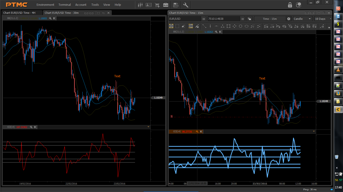
Still have the problem by the way, when I have split screen mode with 2 charts side by side, when placing a line or text label this is auto replicated on all charts, simultaneously, which is a pain.
But nevertheless, Splendid stuff.
regards
Robert
"Still have the problem by the way, when I have split screen mode with 2 charts side by side, when placing a line or text label this is auto replicated on all charts, simultaneously, which is a pain."
We have discussed this question with our analytics before. We will add option "Synhronize tools" in general settings and it will be turned off by default.
Hi Bogdan
Thanks for getting back.
Thanks for answering the feedback too,
Good news about the lines and text un-synchronizing, as I realised there was a control for this, just like the xhair, but cannot find it, obviously, because it is hidden in code.
Excellent about status bar as well.
Saves an extra 20 px or so, plus thickness of the gap, so, nice.
Indicator tool bars could just have a global dialogue box-for adding and adjusting indies, then no need for the tool bars.
Then we access this-these via an icon living in the main tool bar, for chart elements, with a set of drop downs covering add indicator, maybe some sub menus incorporating some of the right click for drawing tools, but something like that, then no need to take up space once there is an icon up above.
Nifty feature would also be to have an indent of some kind so all charts can have the indy window synchronized in height, with a click or two.
The previous CCi levels however could do with extending up to the price axis to fill in the void that is there at present.
Have you considered offering a coding service as well, for those traders wanting a bit more, or in my case, a bit less?
FXCM has a thriving coding community for Marketscope, however it does not extend to functionality or tweaking of the actual platform itself, just indicators.
Which is a pain, as the platform itself works great, but they offer a few skins, but no tweaking of layouts is possible.
And all requests for skin enhancements seem to fall on deaf ears. But its free.
I cant be the only one who wants their layout just so, as when trading I sometimes spend long days looking at something on my screen that I do not like the look of.
Look at the hoo ha Windows 8 caused after Microsofts excellent Win 7 platform.
All the stuff about the start button, which I agree with.
I downgrade all the time to Win 7 as there is a better feel to it, for me.
And traders seem to be a bit more techie than your average bear, so maybe we like our tech tools, I know I do.
Just saying.
But PTMC is just as fast, as FXCM Marketscope in operation and execution, but some of the functions take a click or so too long.
A FXCM rep explained that their TS2 was designed for Asian markets and scalpers, but it works well for all kinds of trading, but I feel you have them beat already.
Anyway, that is it for now, but glad to hear you are open to these suggestions, does you credit.
thanks again
regards
Robert
Okay, fibo tools need a show hide so that if we want to see only the fib level then that is all we see, as the price level is getting too cramped and messy, and personally dont like seeing price.
That is what xhair is for and gets out the way when done.
If not show hide then a color option for the levels and price independently so can set price as background color.
regards
Robert
Okay, fibo tools need a show hide so that if we want to see only the fib level then that is all we see, as with the price level as well it is getting too cramped and messy, and personally dont like seeing price.
That is what xhair is for and gets out the way when done.
If not show - hide, then a color option for the levels and price independently so we can set price level as background color.
regards
Robert

Started testing PTMC for real a few days ago. On a virtual PC in my Mac.
Guys: i love this software. It's so smooth and intuitive. Compared to cTrader, jForex (my current), Multicharts (also wow), Nano-trader (blaah) and so on. It's awasome.
One tiny flaw that really messes up my plans with PTMC: no volume on price range charts. As that is the core value in my trading, that really sucks.
As i have about 20 trainees all the time, who trade on the platform i provide with the broker i recommend, it's a shame, i cannot use PTMC.
It forces me to switch to Multichharts in stead of PTMC. So: is there a workaround, can i make a better volume indicator? Please help.
We have restored volume functionality (update PTMC to get fixes). Now you can see volume for time based and price range agregations (if broker provides this data).
I think we will add possibility to view volumes for all other chart types (if they build from ticks). Our analytics team started processing this question.
Thank you for feedback and don't hesitate to ask if you have another questions.
Hello, Peters Victor!
Could you tell us what broker do you use?
Did you make the volumes visible?
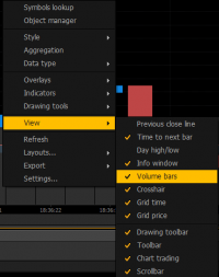
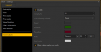
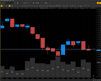
P.S. To make volumes visible, you can use "Volume bars" point from the menu (1) or add the volumes by using the Chart Settings (2).
The first variant :
The second variant :
Also, you can send to us your contacts by email : qa_protrader@pfsoft.org. (In order to solve this issue quickly.)
Regards, QA Engineer.
We wrote to LMAX Support Team about this issue. For the moment, Lmax doesn't provide the correct volume data.
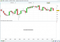
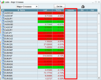
For example, here is the screenshot of LMAX Chart with an active Volume Indicator :
Also, the volume column is empty too :
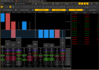
At this point, we provide the possibility to display the correct volume data (based on tick data) in real time :
An example of the correct volume data displaying you can see by using the Protrader Demo server - pt3.protrader.net (Also, we display the trade data) :
If you want to use volume data, you can use broker that provide this data, for example : Oanda.
Regards, QA Engineer.
Thank you for sharing it here a lot! By the way, do you have some Binary options strategy or services which may help with trading bitcoin for a beginner as me. I would appreciate any help from you. Thanks in advance for it!


