error with plotting of renko charts?
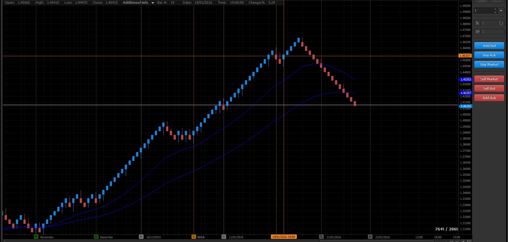
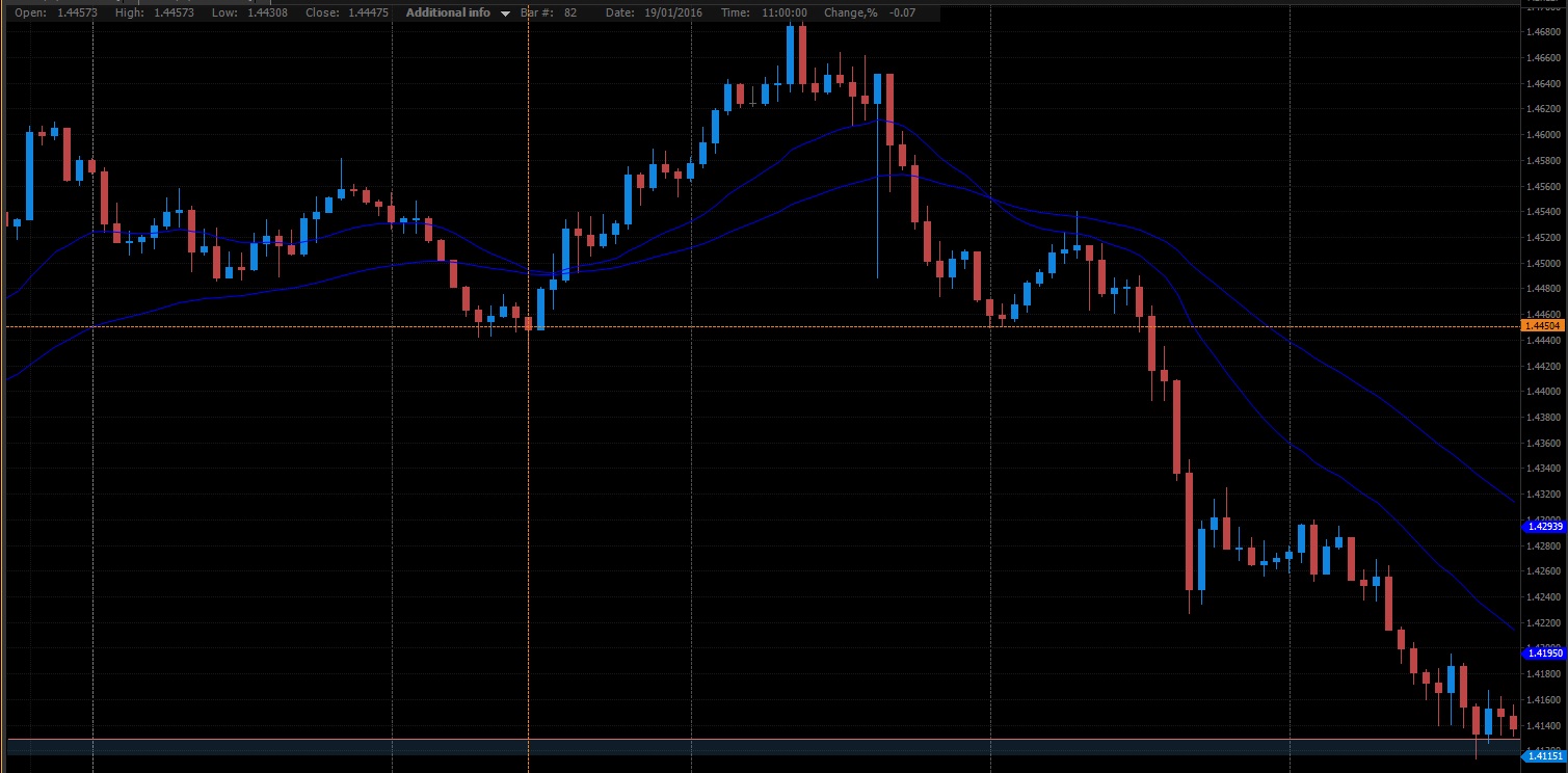
Think there may be an error with the way some of your renko charts are displayed. I have been looking at the "classic with wicks" plots and most of the wicks seem to be incorrectly plotted. For example, if you look at USD/CAD, 350 brick size, 1hr chart, on 19/1/2016 at 11:00. The wick there goes down to 1.44475, when in actual fact during the period it should have gone down to 1.44308, which is quite a big difference. There are loads of examples like this. The data I was using was FXCM live data, however the same problem exists with the protrader demo data as well
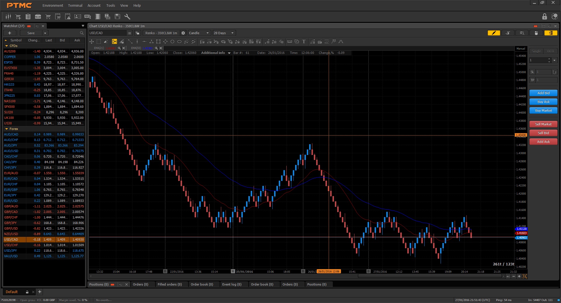
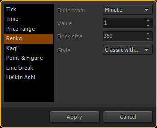
just tried your suggestion....unfortunately those settings produce a completely erroneous chart for "classic with wicks". It is plotting boxes that are far too small for some reason. Seems to work ok with the other 3 styles. However if you are having to use 1 min data to plot it correctly, doesn't that defeat the whole purpose of the classic plots altogether (given the way this plot works is to draw a new block if the price closes above/below on that timeframe.....if you are using a 1 min chart then there is basically no difference between that and the high/low plot). 


