More Visuals please
Hi again.
Been a while since I last posted.
Would like to say things are still looking good, and the time frame changer is excellent now, almost instantaneous from clicking.
Perfect.
So I may be repeating myself but don't ask don't get
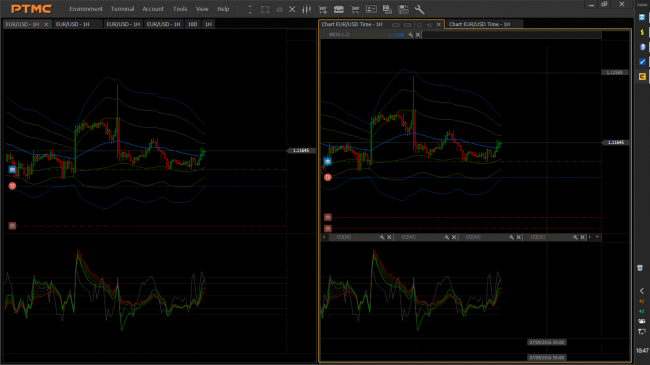
Here is a pic of platform with mods done so we are on the same page with this.
1) Could the upper and lower indicator settings bar-tab have a show -hide as on the left side of pic please.
2) Any possibility of shortening the tabs considerably, as per pic.
The 2 from left I have removed the full screen, link and extra options functions and placed them at the front of the toolbar.
The next 2 I have removed the close-delete button.
And finally the last 2 show how they look with full tab rename to suit individual preferences, and the tab stretches to accommodate text as normal.
All tab functions have been placed in the toolbar as they are only of use on the active tab anyway.
I still feel the words "chart" and "time" are redundant and clutter up the place so be really useful to be able to fully edit the tab name-description.
3) I propose the status bar at bottom has a full show hide function.
If the led needs to be shown maybe have it up by the logo, or just not be visible all the time.
4) Ditto for the workspace tab..
5) Please could the level lines on the lower indicator window extend up to the price axis.
For cci's and stochastics etc.
Still at the moment the lines flash when mouse hovers over settings bar.plus hogs chart space specially with top and bottom displaying.
6) If the toolbar had more functions available to it when customizing this would be great too, as I would then stick all my favorite functions and tools into this.
7) One last thing for now, would it be possible to make the chart surround only one pixel thick, and then this coincides nicely with the tab focus when active.
8) Oops, one more just one more thing.
About the chart zoom in-out, could the bars per click be tailored to be finer adjustment please, feels a bit coarse when scrunching up the chart for Elliott Wave counting.
PTMC is set at 22 bars per click at the moment, maybe if the chart zoomed only 6 to 8 bars per click would be better, for me anyways.
Ah, still one more thing, if the fullscreen had the tabs show that would be perfect, and then I would spend all my trading time in fullscreen mode.
thats it for now, and I hope some of these will receive consideration, as I am still on a max chart and less other visuals mission.
Keep[ up the excellent work that you guys are doing.
regards
Robert
Just read in Chris Williams post that there may be a way to create plugins and enhancements, and will be very grateful for the information and documentation on this if it is available.
Hello, kaspo999!
About plugins you can read in this topics:
- How to create a PTMC custom panel in a 5 steps?
- Examples of the plugins.


