

Non-standard charts in Protrader
Hey there, Protraders!
Non-standard types of the price charts will be the topic of today’s article. Currently many traders use for price analysis the so-called standard chart types. Bars, Japanese candlesticks and line chart can be attributed to this type. Let’s notice that all these types of graphical displaying depend on time. The most common methods of technical analysis are based on the usage of these chart types. As an example, we can distinguish candlestick analysis and various geometric constructions.
But there are other graphical representation methods of price changing. Protrader terminal has in addition to the aforementioned bars, Japanese candlesticks and line charts many other non-typical chart types:
- Dots;
- Dotted line;
- Forest;
- Solid;
- Line break;
- Renko;
- Kagi;
- Point & Figure;
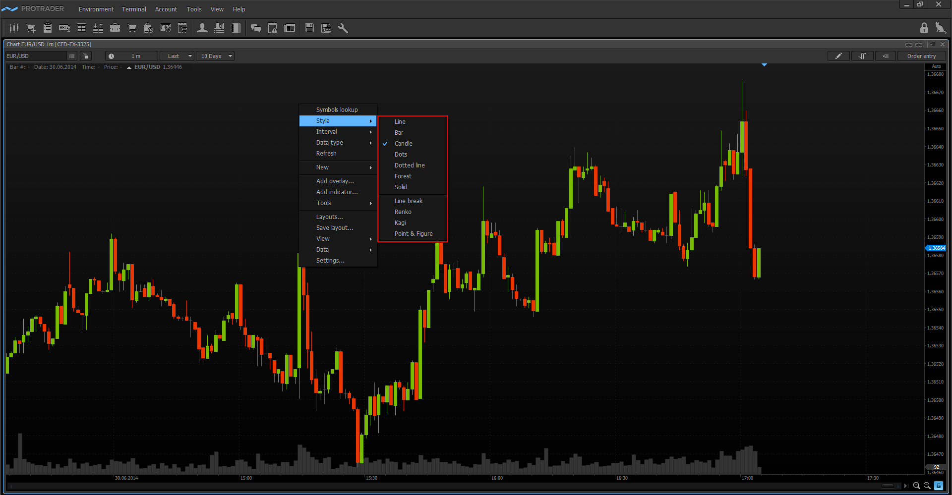
The first four types from the list, including Solid, only change the drawing style of price changes, while the following four types have significant differences in the algorithm of chart plotting. What is so interesting about these non-standard chart types? Let’s consider each of them in details.
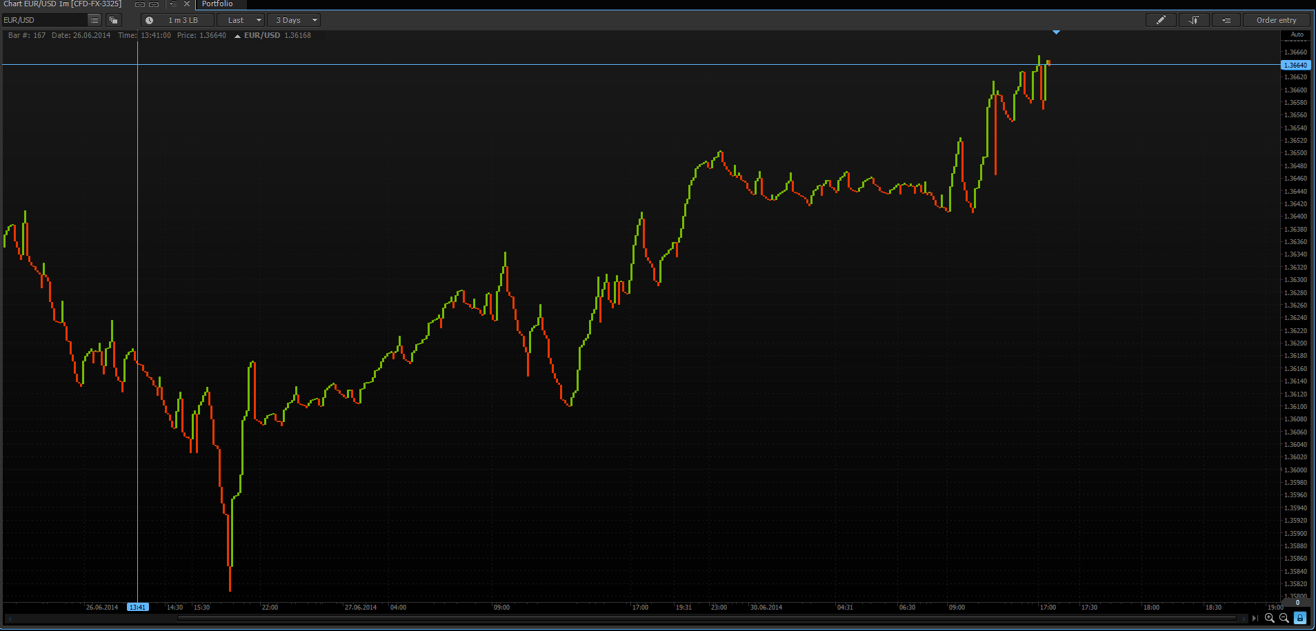
Line break
The line break chart consists of vertical rectangles. The appearance rules of these rectangles are:
- Determine the start price of plotting.
- Compare the start price of plotting with close prices of the following time periods.
- Plot the first rectangle green if close price of selected time period is higher than the start price of plotting. Plot the first rectangle red if close price of selected time period is lower than the start price of plotting.
- Plot the second rectangle green if maximum of selected time interval is higher than maximum of previous green rectangle. Plot the second rectangle red if minimum of selected time interval is lower than minimum of previous red rectangle.
- Plot the third rectangle green if its maximum is higher than maximum of two previous green rectangles. Plot the third rectangle red if its minimum is lower than minimum of two previous red rectangles. Or, we don’t plot a rectangle if prices of the last time period are in the range of previous rectangles. Subsequent rectangles are drawn by similar rules until the line break occurs.
- The line break occurs in the case when the price of the last time period is higher than last three red rectangles, or is lower than last three red rectangles.
The advantage of such price movement displaying is that the trend is clearly visible on the chart. The line break charts can be plotted not only by three lines, as written in the example, but also by any arbitrary number of lines.
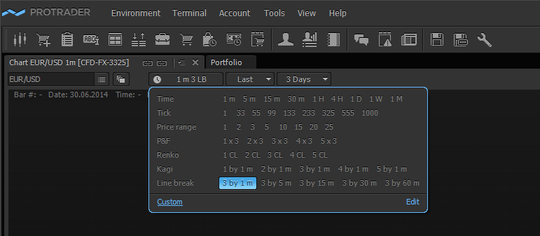
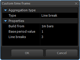
In order to change the parameters of chart plotting go to “Aggregation type” window, activate the “Custom” tab and set up the algorithm of chart plotting.
Basically, the line break chart is used by traders for better definition of the trend change on the market. The main types of graphical analysis can be also applied to this chart type: trend lines, support/resistance levels.
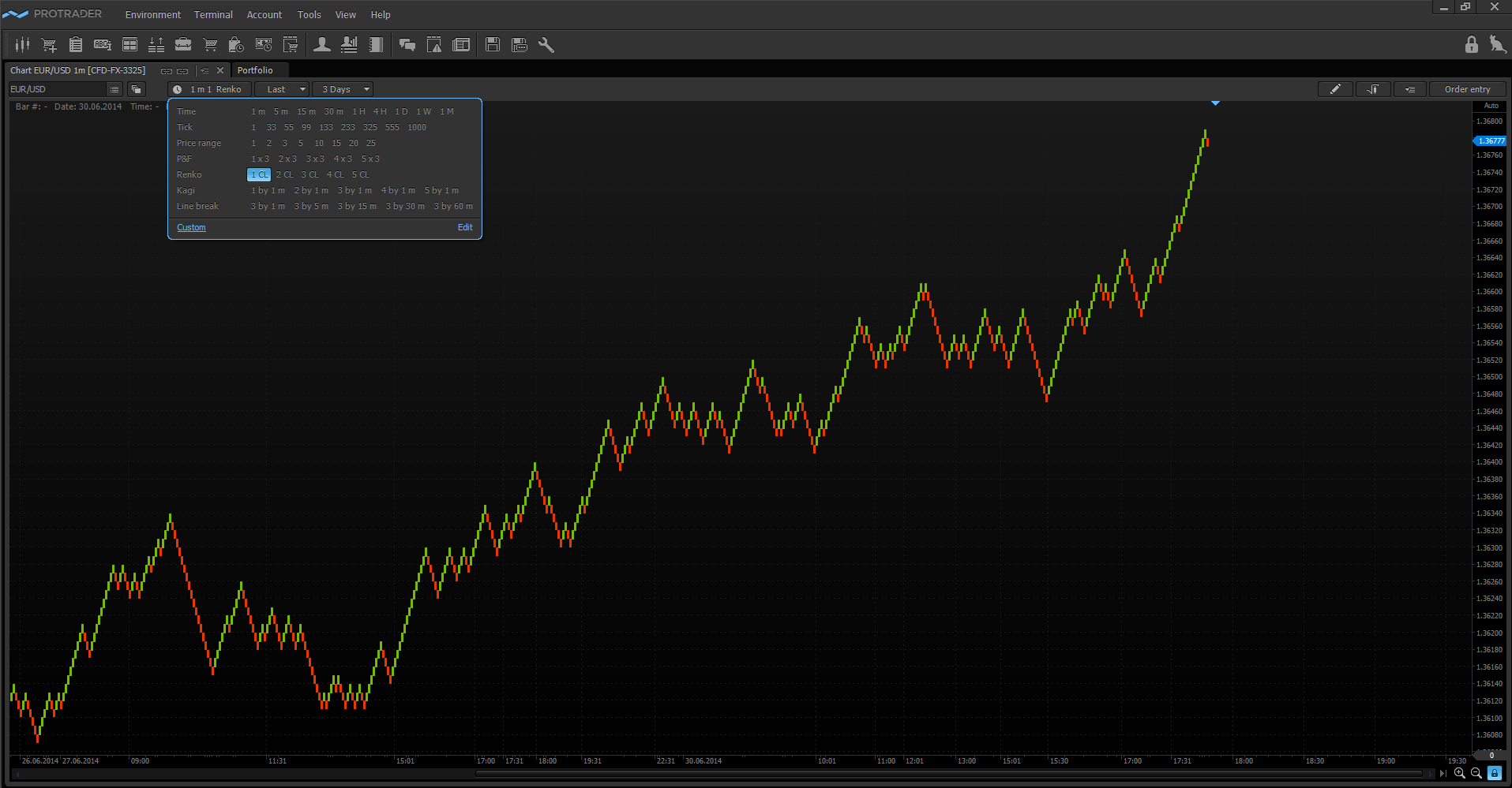
Renko
Renko charts were invented by Japanese traders. Perhaps, this name is derived from the Japanese “Renga”, which means brick. Why this analogy is not accidental, you will see below.
An algorithm for plotting:
- Close price of current selected time period is compared with maximum and minimum of the previous “brick”.
- If close price of selected time period is higher than maximum of the previous “brick” at least on one set “brick’s” value then we plot one or more green “bricks”.
- If close price of selected time period is lower than minimum of the previous “brick” at least on one set “brick’s” value then we plot one or more red “bricks”.
Thus, plotting of the Renko chart only indirectly depends on the time, the main parameter is the price movement. All “bricks” on the chart are equal; their size is chosen based on preferences and tasks of the trader. Often it is adjusted by the average volatility of the observable asset. The advantage of Renko chart is that the trend and support/resistance levels are better defined, since it filters minor changes of the quotes. The main types of graphical analysis can be applied to the Renko charts as well as to the Line break chart. The “brick” size and other parameters of the Renko chart plotting can be set in the “Aggregation type” window by activating the “Custom” tab.
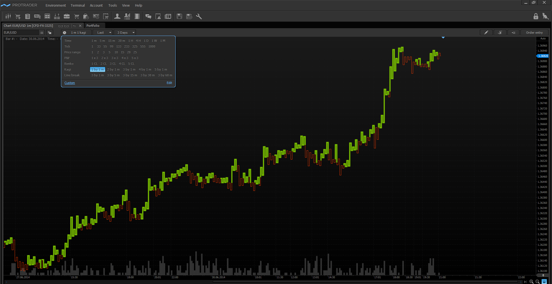
Kagi
Kagi charts as well as Renko charts were invented by Japanese traders. And they also as Renko charts do not directly depend on time. Kagi chart is a sequence of thick and thin vertical lines connected by horizontal lines. The lines are divided into two groups by thickness, thick - "yang", and thin - "yin". Points of changing the chart direction also have their names: local maximum is called “shoulder” and local minimum – “waist”.
When thin line (“yin”) becomes higher than previous maximum (“shoulder”) then thin line is replaced by thick one (“yang”). Conversely, when thick line (“yang”) becomes lower than previous minimum (“waist”) then thick line is replaced by thin one (“yin”).
An algorithm for plotting:
- Define the start price of plotting.
- Compare the start price of plotting with close prices of the following time periods. If close price of the following time period is higher than the start price of plotting then we plot thick vertical line upwards to the last close price. Mirror reverse rule acts for plotting a thin vertical line downwards.
- If the price continues to grow or fall on the following time periods then we continue to plot thin and thick lines regardless of the movement value.
- If the line is moving upwards and new close price is lower by the reversal value then we plot short horizontal line and then a new line downwards to the close line.
- If the line is moving downwards and new close price is higher by the reversal value then we plot short horizontal line and then a new line upwards to the close price.
- If the reversal value is not exceeded then the movement is ignored.
The reversal value is chosen individually for each trading symbol.
The generally accepted signal when trading using Kagi charts is to buy on the “yang” lines and sell on the “yin” lines. The standard methods of graphical analysis can be used on Kagi charts as well as on the other chart types. The reversal parameter and other parameters of the Kagi chart plotting can be set in the “Aggregation type” window by activating the “Custom” tab.
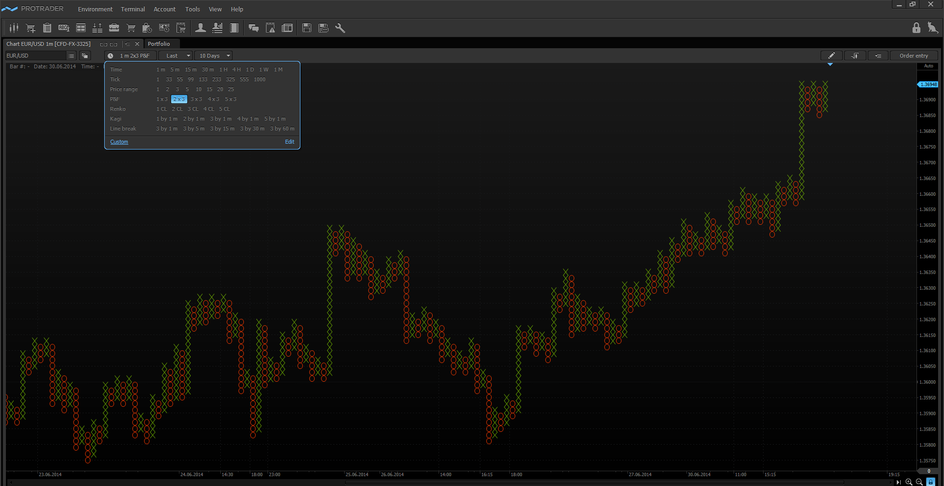
Point & Figure
Point & Figure chart as well as the above-described types of the undated charts is successfully used by traders worldwide. Basically, these charts are used on the large time intervals.
An algorithm for plotting:
- Only close price is used for selected period. If price grows by the “cell” size then we plot the “figure”. If price falls by the “cell” size then we plot the “point”. “Cell” is the chart parameter which is determined by trader.
- If the price movement unfolds more than by the reversal value then a new column is built with “figures” or “points”. Several “cell” values are generally set as the reversal indicator. So, for example, the reversal value ‘3x’ tells us that a new chart column will appear only when the reverse price movement will be more than 3 “cell” values.
The feature of the Point & Figure chart is in that it reflects the market cycles of activity, because if the market by its movement does not exceed the "cell" size, then new cells will not be built on the chart. Thus, the trader will see only the market movement with high volatility, and minor movements of the market will be ignored. The trading strategies on the Point & Figure charts are based on the construction of trend lines and support/resistance levels.
In order to set the Point & Figure chart go to “Aggregation type” window and activate the “Custom” tab.
In today’s article we reviewed the chart types available for Protrader users. The terminal provides a variety of tools for graphical displaying of the price data including individual chart settings.
Have not tried PTMC yet? There is no better way to boost knowledge than to use it! Start trading with PTMC now!

