Chart randomly looks strange.
Firstly i need to apologize for the vagueness in this post. It's difficult to describe exactly what's wrong.
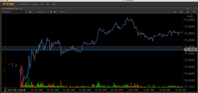
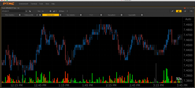
Randomly PTMC's charts will start displaying too narrow, like the bars have been squished / compacted together / the bars should be wider. Here is a screenshot.
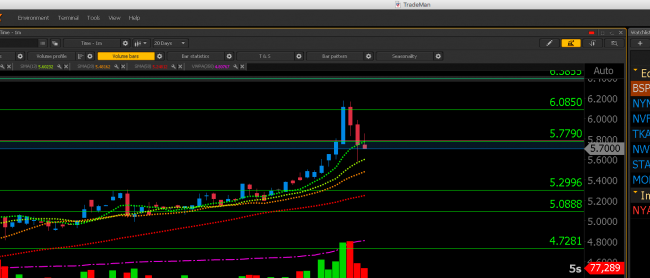
I've found some old screenshots of charts that are displaying correctly as a comparison.
Unfortunately i do not have a set of screenshots showing the same ticker / time frame where one displays correctly and the other does not so it's difficult to make a direct comparison.
The charts changing like this is something that happens randomly and usually a reboot fixes the issue. Without touching any settings or view controls, switching from one symbol to another will cause this to happen. After a reboot, it's fixed.
Right now though reboots aren't working and i'm stuck in compacted / squished chart mode.
// Edit
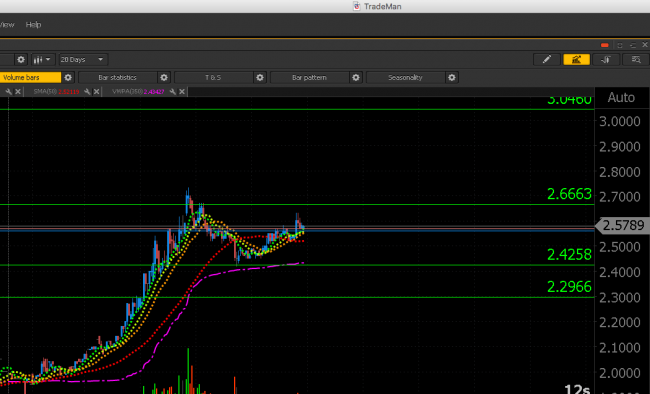
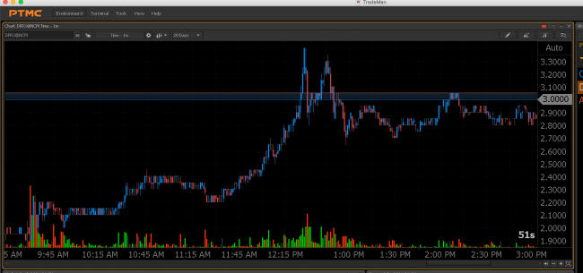
More examples... It just looks odd. I can't really say why.
Randomly PTMC's charts will start displaying too narrow, like the bars have been squished / compacted together / the bars should be wider. Here is a screenshot.
Unfortunately it's hard to make a conclusion according to the distance between bars because of the differences in chart zooming.
About the screenshots :
More examples... It just looks odd. I can't really say why.
This chart looks squished because of the strong upward movement in the right part of the chart, and a low variations with a weak volatility movement in the left part of the chart.
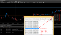
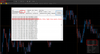
Please, look at this data list (it was sent by IQFeed), it can confirm, that data is correct :
I tried to catch a squashed bars, but according to the IQFeed data, these bars were built correctly (please, look at high / low data for all period).
Here is an example with the second screenshot :
Could you give us more information about an issue? Screenshots / examples with the same zooming and timeframe on both charts can be especially usefull.


