

How to understand a Renko chart?
Most traders are using time-based charts for their trading needs. But let's think about, what really matters in trading - price!
It's all about this one-dimensional value. There is no need for the time dimension, as the price is not dependent on time. Whether it took the price to form new high hours or even days, all a trader cares for is eventually the price. This is, where Renko bars will come into action.
Renko charts were invented by the Japanese and are thought to be named after the Japanese word Renga, which can be translated as "Brick". Some years ago, they were marketed as Point and Figure charts, with a time axis, because the bricks are shifted to the right, as it happens with time-based charts, once a brick is complete. Time and volume are not included with these form of charts.

Renko charts address the most important value – the price – perfectly, as they are time independent. Let us look how they are constructed and why they are independent of time first.
How Renko charts are created
The basic element of a Renko chart is a brick. It can be seen as a bar, but with the difference, that it has a fixed size. This fixed size can be set to any value the trader likes and will be the same value for up and down. As an example, we look at Figure 1.
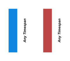
Figure 1: Renko bricks are formed regardless of the amount of time, but only from a distance
Let's discuss the methods to select an optimal brick size later. For now, we choose a brick-size to be e.g. ten pips, assuming there are no bricks currently created on the chart. At every change in the price of 10 pips in the up or down direction, a new up brick (Dodger Blue color) or down brick (Indian Red color) will be created. The timespan, which takes to create one brick, can be any from a few seconds to many hours.
Let’s look at four different scenarios, which go into brick creation (we still use a brick-size of ten pips for our scenarios):
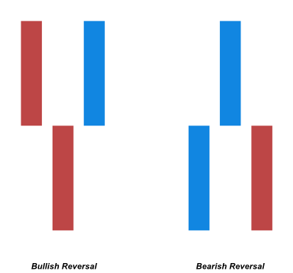
Figure 2: Bullish and Bearish Reversals of Renko charts
- If there is an up brick before and the price will go up another ten pips, a new up brick is be created
- If there is a down brick before and the price will go down another ten pips, a new down brick is created (see Figure 2)
- If there is an up brick before, price needs to go down twenty pips, to create a new down brick
- If there is a down brick before, price needs to go up twenty pips, to create a new up brick (see Figure 2)
We can see from #3 and #4, that a price reversal is only occurring after double the brick-size.
Main advantage of Renko chart is filtering out the noise
The way, Renko charts are constructed, offers the big advantage of filtering out the noise on the chart. Brick's open and close acts like a boundary for a price movement within a given range, the brick-size. As long as the price ranges between these boundaries, be it a few seconds or even days, no new bricks will be formed. This will give us smooth, noise-filtered charts.
Taking advantage of noise-filtered charts
Noise on the chart can clutter up our charts very fast and block the view to spot important market structure. Chart formations like double tops, trends, reversals and consolidation areas can easily spot with a blink of an eye, as can be seen in Figure 2.
Why are Renko superior to time-based charts
Like mentioned before, Renko charts take time out of the equation. As the charts are only based on real price action, bricks will only be plotted, if there is a specific movement in price. This filters out noise created by tight price ranges or congestion zones. If there is no price movement at all, the charts will not get cluttered up by small bars or Dojis like with time-based charts. There is no need to look for higher/lower time frames like with time-dependent charts, as there is no time involved. A finer grained chart can be produced by decreasing, a course gained chart by increasing the brick size. Significant market structures can be seen at a glance, as every bar has the same size and the open/close of future bricks can be easily be projected. The programming complexity of indicators, strategies and pattern recognition is also eased with a substantial amount, as any brick has the same size.
What Renko charts are not good for
Renko charts don't use volume at all. So any trader, which relies on volume or trades would need to add some additional studies like Cluster (Footprint) chart type mechanisms to them. The forming of a brick could take seconds or even days, depending on the brick size. This might be an issue for traders, who rely on a guaranteed time frame because a new bar will appear. Indicators, which rely on time-based calculations, cannot be used for Renko charts, as there is no time factor involved, but only a particular price range.
Price movement is the only variable for creating new bricks. So the timespan, in where new bricks are created, can be very different throughout time. This can be seen in Figure 3a and Figure 3b. The Renko chart has an irregular time-axis compared to the Candle Stick chart, as price movement was not the same throughout the time span.
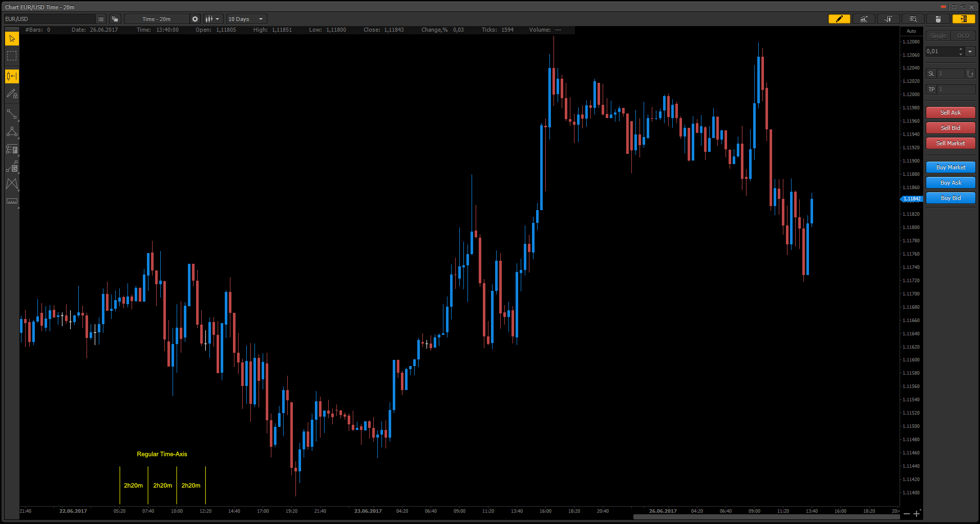
Figure 3a: Regular time axis has predetermined time intervals
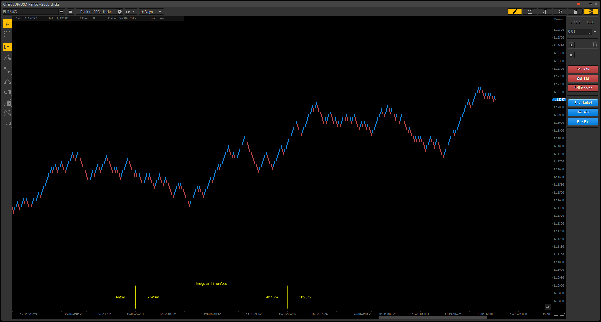
Figure 3b: Renko charts have irregular time axis
Errors you should avoid
Spreads/Brick size
Tight spreads are always to go for. So if you have direct market access, you should favor it to spread markup. Tight spreads will allow closer stops and smaller brick sizes if you are used to short time frames like M5 or even M1. Based on experience, your brick-size should be at least five times, or even ten times, of your spread. If the brick-size is not acceptable to the spread, the bricks won't give price enough room to breath and bricks will be plotted because of the spread, and not necessarily overall price movement itself. An example can be seen in Figure 4.
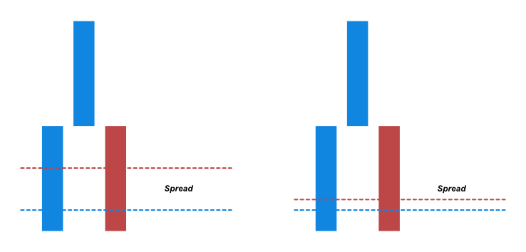
Figure 4: Spreads
Time aggregation vs. Ticks
If your trading platform supports plotting Renko charts based on ticks, always use it in favor to time aggregation. Only tick based Renko charts will give you the full benefit of correct price movement. Time aggregation creates Renko bricks after the time passed you chose for the aggregation. E.g. if you choose one minute for your time aggregation, all Renko bricks, that would have been created based on price movement, will be plotted at once after one minute. The difference can be seen in Figure 5.
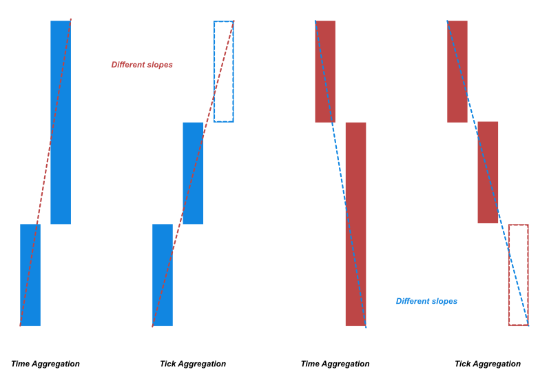
Figure 5: Time and Tick aggregations for Renko chart
Such a setup bring a time dependency into a time-independent chart type. This will give wrong results for indicators and calculations as you can see in the dashed yellow line having a different slope. Choose the minimum time aggregation your trading platform supports if there is no tick support for Renko charts.
Redrawing issues
There are three ways of how Renko charts can be implemented and are offered by various charting packages:
- Plotting starts based on an (artificial, when using other forms of Renko charts than classic) open of the first historic quote. This leads to a problem some traders have issues with: the shifting of bricks when refreshing a chart. This happens, when some historical quotes have changed over time, and the base for the first brick is not the same quote as before. E.g. your charting package shows a maximum amount of 200 bricks. When a new quote is coming in, it has to delete the last historical quote, and the Renko bricks are plotted based on the previous quote. The refreshed chart has a greater amount of historical data and the bricks will be plotted with a shift. This change is the difference between the price difference between the prior and the new quote.
- Plotting starts at a price selected by the trader. E.g. the parity price of a currency pair (EUR/USD with a price of 1; USD/JPY with a price of 100). The selected price level will act as artificial open for the first Renko brick. All other bricks will be plotted backward and forward from the first brick. As the price is always the same, regardless of the size of the price history, the chart always looks the same after refreshing the chart or altering the historical data range.
- Plotting from the last incoming, real-time quote backward for a specific amount of bricks. This also ensures the chart not to be shifted after a refreshing, as the complete history will be processed from the actual quote to the last and the base for the first brick will be the most up-to date quote, which was a correct open of a brick formed in the past.
Different forms of Renko charts
Classic Renko chart
This form just stacks the individual bricks on top or below of each other as seen in Figure 3b. With this form, pullbacks are not smoothed out that much and reversals are harder to spot than with other types.
Median Renko chart
The Median Renko chart or Mean Renko chart has an artificial open shown with a yellow dashed line as seen in Figure 6. This open is in the middle of a Brick. When a Brick is closed, there will already be the half of the new Brick plotted on the chart. Median Renko smoothes out the chart more than Classic Renko. They will show fewer pullbacks and trend reversals are easier to spot as seen in Figure 7.
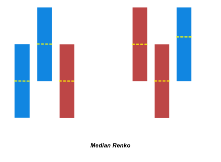
Figure 6: Formation of Median Renko chart
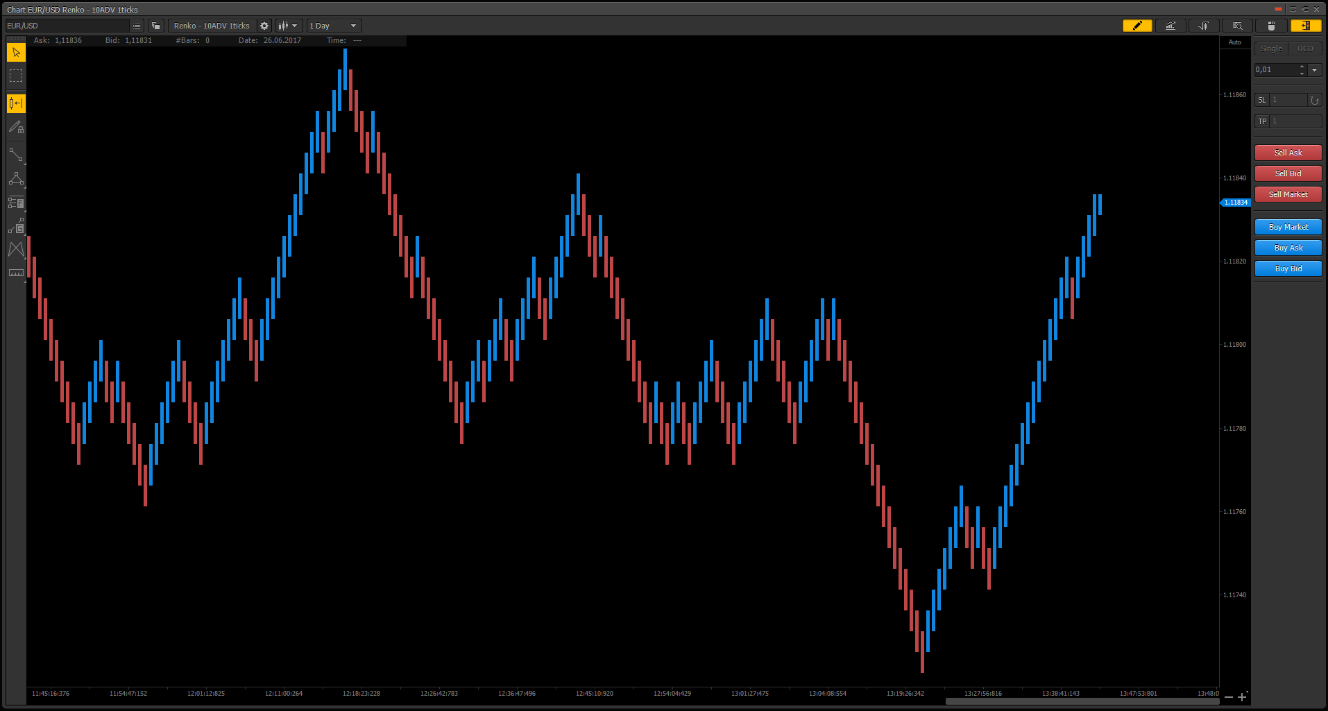
Figure 7: Median Renko in PTMC trading platform
Geometric Renko chart
The Geometric Renko has an artificial open shown with a yellow dashed line as in Figure 8. This open is at the extension and inversion percentage, e.g. 12% of the brick, seen as the light blue color of the second brick in Figure 8. An extension and inversion value of 50% would create Median Renko bricks.
One special property of these Renko form is, that when using an extension and inversion percentage of 12.5%, the slope of up-bricks will be 45° and for down bricks -45°. As seen in Figure 9, Geometric Renko will give you very smooth reversals, and the charts are smooth out more than with Median Renko.
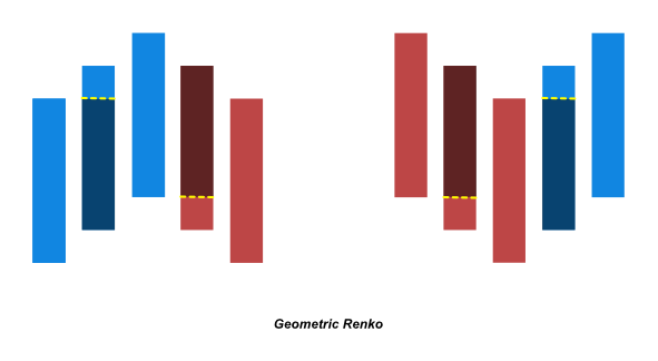
Figure 8: Formation of Geometric Renko chart
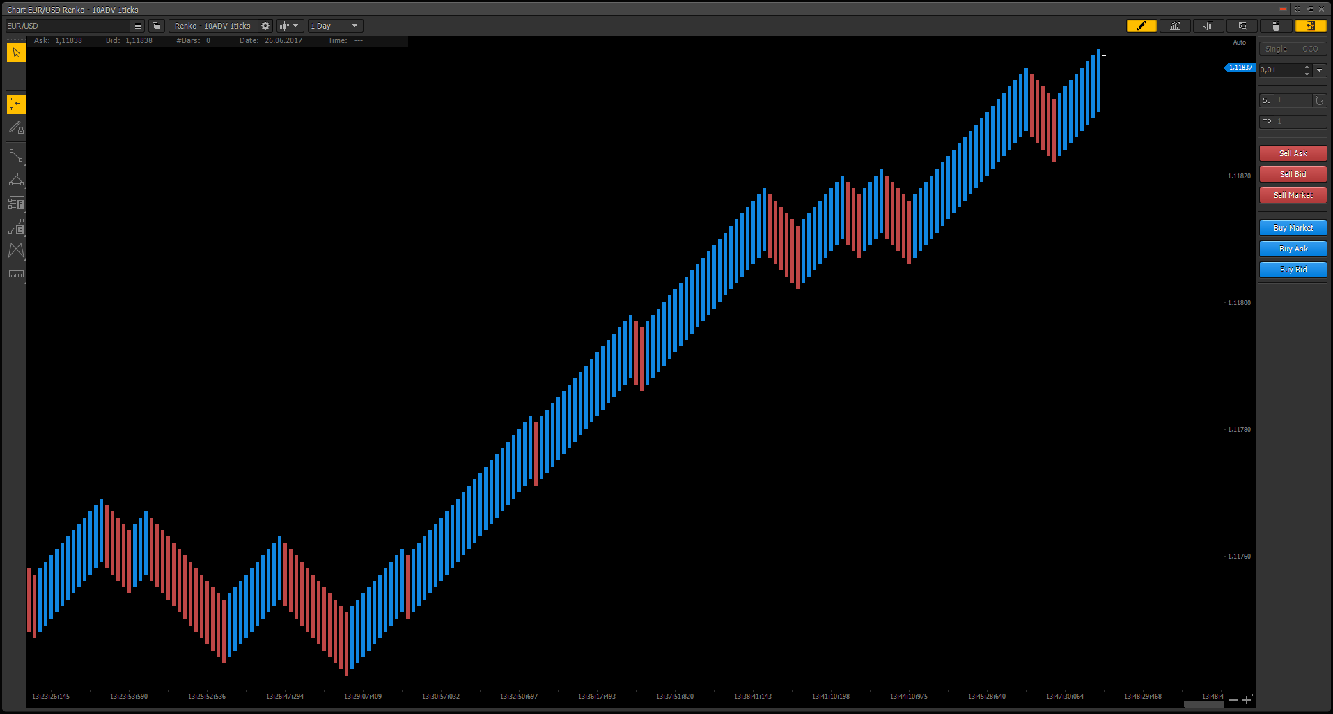
Figure 9: Geometric Renko in PTMC trading platform
Turbo Renko chart
The Turbo Renko has an artificial open shown with a yellow dashed line as seen in Figure 10. This open is at the extension, e.g. 12% of the brick, seen as the light blue color of the second brick in Figure 10, but with an inversion of 100%. The difference to Median Renko lies in the inversion percentage, which has a value of 100%. This smooths out the majority of pullbacks and only shows high probability reversals as seen in Figure 11. Price has to reverse by a complete brick to form a reversal, illustrated as the dashed bricks in Figure 10.
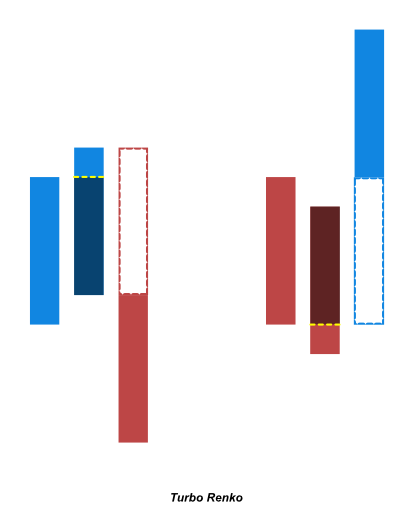
Figure 10: Formation of Turbo Renko chart
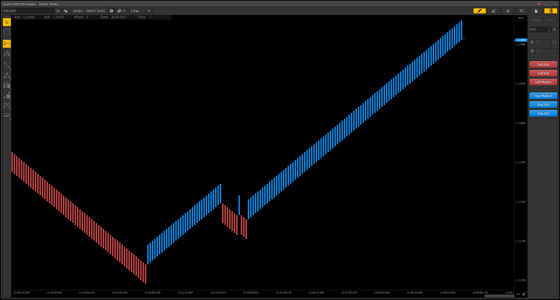
Figure 11: Turbo Renko Chart in PTMC trading platform
Conclusion
As you can see, there are multiple different forms of Renko charts besides the Classic form. Each of it can be used for various needs like smoothing out noise, smoothing out pullbacks or emphasize on reversals. The common between all of the forms is their independence to time, their ability to smooth out the chart and the possibility to spot market structure and price patterns at a glance.
Have not tried PTMC yet? There is no better way to boost knowledge than to use it! Start trading with PTMC now!
-
 Aonghas 10.07.2018
Hello, I trade price action and for me Renko Chart is perfect.
But I have a question. In your explanation, you don’t explain what is exactly “value” set and “New box on Break” if “value” box is more 2.
So what is exactly “value” and check box associate?
After your explanation, I think this article will be very perfect.
Thank-you very much for your answer.
-
BeardPower 17.07.2018Hi,
Thank you for your comment!
Are you asking about the PTMC settings used for the Renko charts in the article?
Where do you see "New box on break" and a value of more than 2?
Please clarify what you mean and I am happy to answer your question.
Thanks!
-
Aonghas 18.07.2018
Hello,
So my english is not good, and I make a mistake in my description.
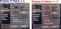
When you use Renko, you can choice :
- Build form : (choise : Tick, Second, Minute, Hour, ...)
- Value : (1) ???
- Brick size : (it is the size of the brick in Tick)1) What is exactly the feature of Value and how to use it ?
2) When I select value 2 or more, there a a new box : "build current bar", I don't see a différence when check or not check ?
3) What the différence between brick size and value if I use a build form in Tick ?
This screening shot, it is more easy to understand.
Thank-you very much for your answer.
-
BeardPower 19.07.2018I see, no problem.
1.) The value is specifying the aggregation period based on the selected build form. E.g. if you select Tick and a value of 1, it will calculate the Renko bricks based on every Tick. If you select Minute with a value of 15, it will calculate the Renko bricks based on every 15 minutes.
2.) The option "build current bar" is to show/visualize the creation of the current brick in real-time. This visualization is updated with every tick, so the option will not show for a value of 1, because the minimum update period of the chart is already 1 tick and the "build current bar" is just using 1 tick for it's visualization. Setting a value of 2 or more will not change this visualization (as the visualization is always based on every tick), but what the value does is specifying the period when the new bricks will be drawn (see "Time aggregation vs. Ticks" in the article explaining the aggregation type).
3.) The difference is the following: the brick size specifies the size of a brick in ticks and the value is specifying the period after which the chart should calculate and draw the new bricks.
-


